East Bay Sanctuary Covenant
identity design / art direction
A Participatory Visual Rebrand
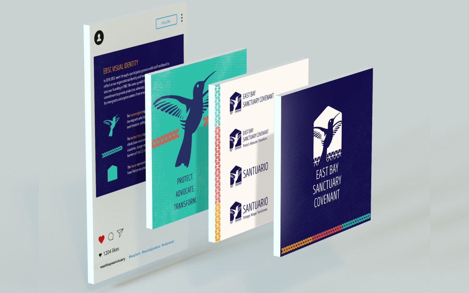
East Bay Sanctuary Covenant hired me to lead their first organizational rebrand in their 37 year history of providing legal services to asylum seekers and refugees. I led a human-centered design process with staff and board that included researching challenges and opportunities in how they were perceived and designing a new visual identity, style guide, and print and digital collateral. We collectively developed three core EBSC symbols to express the brand’s commitment to providing protection, advocacy, and transformational education for immigrants and asylum seekers from around the world:
The hummingbird represents the courage and resilience of the migrants who travel sometimes thousands of miles to seek freedom, safety, and the chance to start life anew.
The barbed fence represents the enormous obstacles our clients have overcome, including trauma in their home countries, danger on their journey to the U.S., and the barriers of the U.S. immigration system.
The house represents shelter and sanctuary for those who have fled persecution, violence, and extreme poverty.
Design Services
Brand Strategy
Retreat Facilitation
Art Direction
Asset Management
Style Guide
Visual Design
Illustration
Collateral