
Thrive Agenda
art direction / comms strategy / identity design / copywriting
A Coalition-Building Style Guide
In 2020, progressive organizations, unions, and legislators coalesced around a bold plan for economic renewal: the Thrive Agenda.
The U.S. progressive movement needed a way to rally popular support that didn’t separate groups by sector. I designed Thrive Agenda to communicate dignified jobs that address the interlocking crises of climate change, racial injustice, public health, and economic inequity.
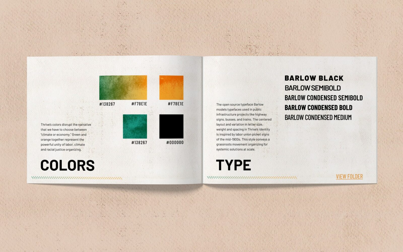
Colors
Thrive’s colors disrupt the narrative that we have to choose between “climate or economy.” Green and orange together represent the powerful unity of labor, climate, and racial justice organizing.
Type
The open source typeface Barlow models type used in public infrastructure projects like highway signs, buses, and trains. The centered layout and variation in letter size, weight, and spacing in Thrive’s identity is inspired by labor union picket signs of the mid-1900s. This style conveys a grassroots movement organizing for systemic solutions at scale.
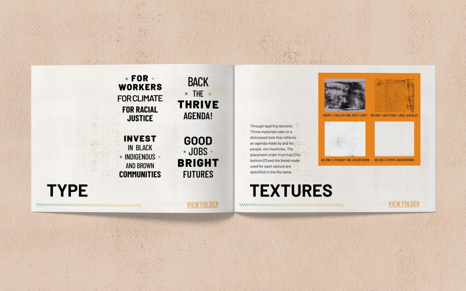
Textures
Through layering textures, Thrive materials take on a distressed look that reflects an agenda made by and for people, not machines. The placement order from top to bottom and blend mode used for each texture are specified in the file name.
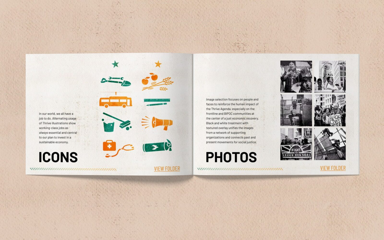
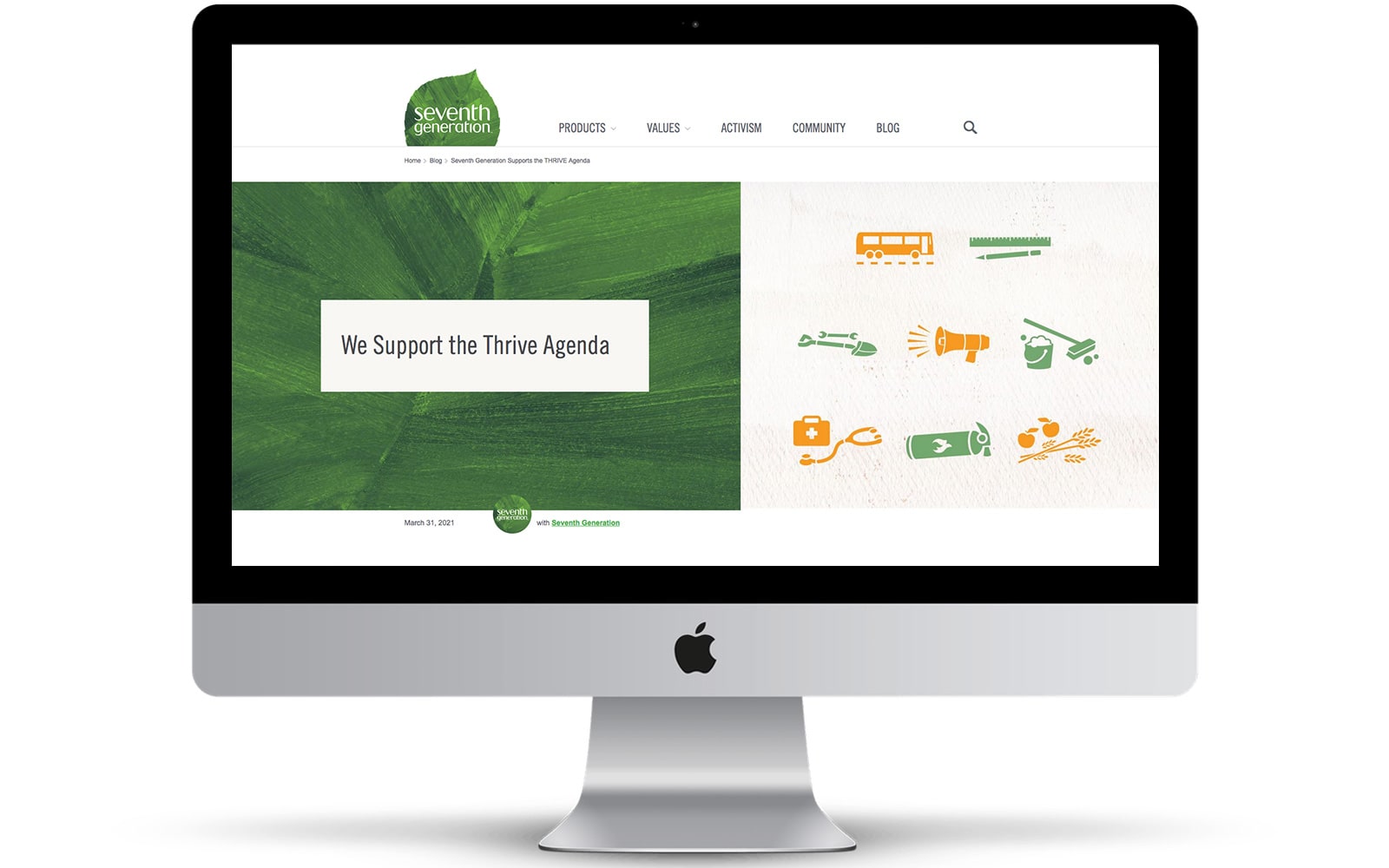
Icons
In our world, we all have a job to do. Alternating usage of Thrive illustrations show working-class jobs as always essential and central to our plan to invest in a sustainable economy.
Photos
Image selection focuses on people and faces to reinforce the human impact of the Thrive Agenda, especially on the frontline and BIPOC communities at the center of a just economic recovery. Black and white treatments with textured overlay unifies the images from a network of supporting organizations and connects past and present movements for social justice.
Design Services
Art Direction
Brand Strategy
Communications Strategy
Copywriting
Style Guide
Visual Design