THE BLOG

22
Feb
17
Sep

East Bay Sanctuary Covenant

A Participatory Visual Rebrand

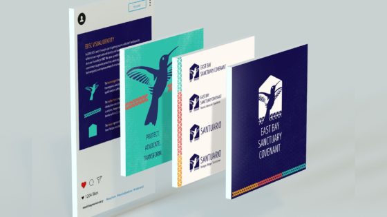
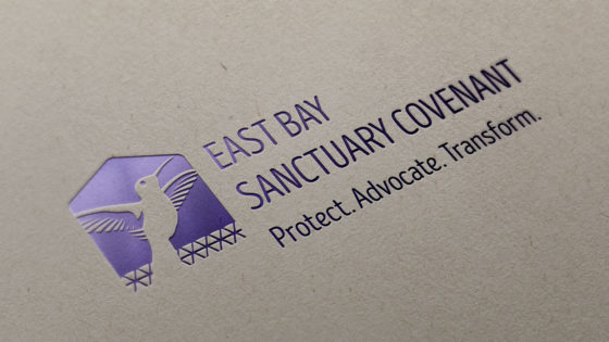
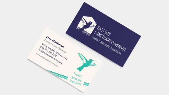
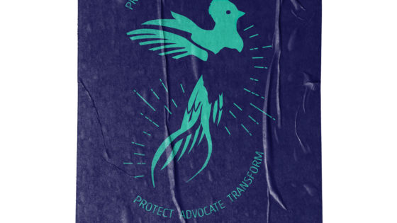
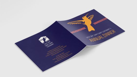
East Bay Sanctuary Covenant hired me to lead their first organizational rebrand in their 37 year history of providing legal services to asylum seekers and refugees. I led a human-centered design process with staff and board that included researching challenges and opportunities in how they were perceived and designing a new visual identity, style guide, and print and digital collateral. We collectively developed three core EBSC symbols to express the brand’s commitment to providing protection, advocacy, and transformational education for immigrants and asylum seekers from around the world:

The hummingbird represents the courage and resilience of the migrants who travel sometimes thousands of miles to seek freedom, safety, and the chance to start life anew.

The barbed fence represents the enormous obstacles our clients have overcome, including trauma in their home countries, danger on their journey to the U.S., and the barriers of the U.S. immigration system.

The house represents shelter and sanctuary for those who have fled persecution, violence, and extreme poverty.

Design Services

Brand Strategy

Retreat Facilitation

Art Direction

Asset Management

Style Guide

Visual Design

Illustration

Collateral
 

02
Aug

Sanctuary Streets

The Project

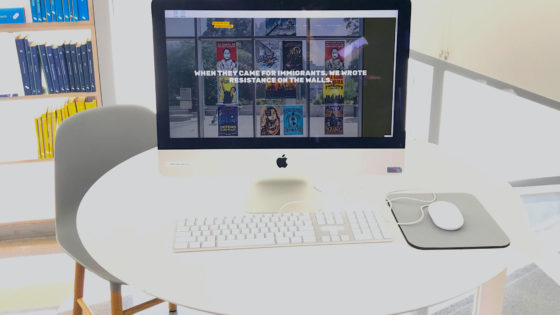
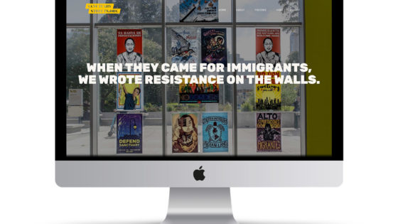
Our community is only as strong as the values we publicly defend. But right now, the Trump Administration is attacking immigrants with house raids, separating families, and locking children in concentration camps.

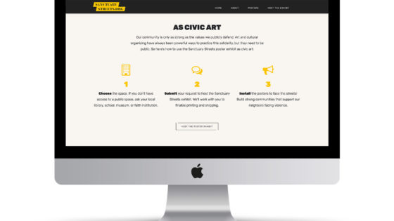
We know that we are stronger and safer when we take bold public action to keep families together. Art and cultural organizing have always been powerful ways to practice this solidarity, but they need to be public.

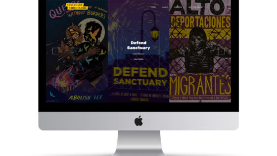
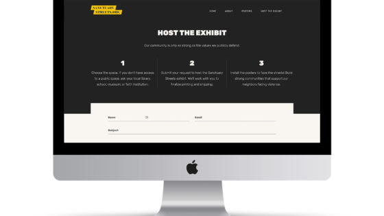
Sanctuary Streets offers a public poster exhibit to build strong communities. You can host the 12 posters in any public space, whether it’s a school, museum, library, faith institution or other community center. The only requirement? The posters face the street.

Poster Artists
  • Design Action Collective
  • Jess X. Snow
  • Jessica Sabogal
  • Jesus Barraza
  • Jules Cowan
  • Kate DeCiccio
  • Mazatl
  • Micah Bazant
25
Jul
30
Apr

Greta Thunberg Illustration

Youth Leaders. Adult Allies.

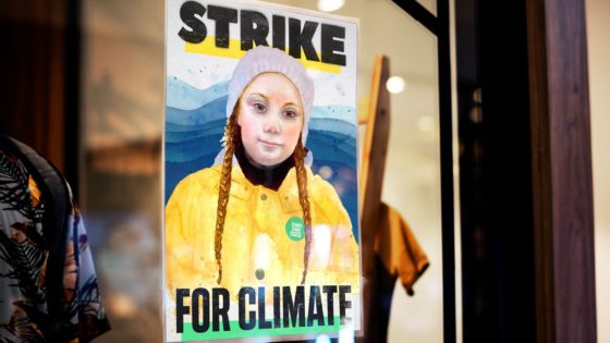
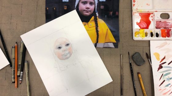
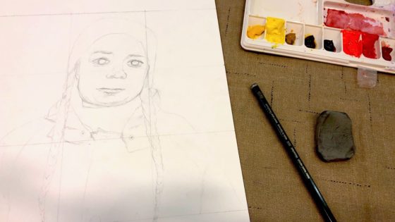
This watercolor illustration and digital media poster features Greta Thunberg, one of many youth climate activists leading mass action across the globe. This movement does not have one leader, and diverse youth continue to demonstrate the power of intersectional organizing for a livable planet. The artwork features Greta wearing a button for the largest climate justice mobilization in history, which took place on September 20, 2019. The color palette and typeface take direction from the Global Climate Strike style guide.

The Poster Series

The poster was used by Greta Thunberg’s organization Fridays for Future and the climate justice organization 350.org. The illustration joins a poster series of youth leaders Isra Hirsi, Artemisa Xakriabá, Jamie Margolin, Xiye Bastida, and Vic Barrett.


18
Aug
17
Aug

Thrive Agenda

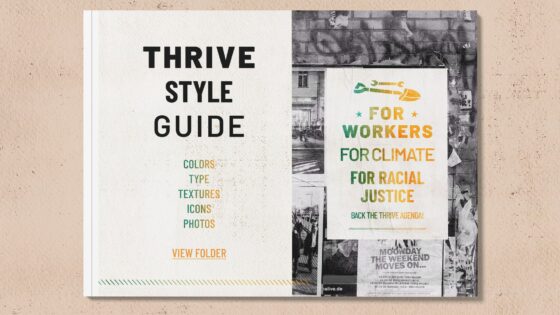
A Coalition-Building Style Guide

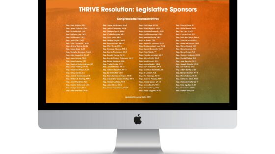
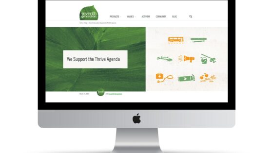
In 2020, progressive organizations, unions, and legislators coalesced around a bold plan for economic renewal: the Thrive Agenda.

The U.S. progressive movement needed a way to rally popular support that didn’t separate groups by sector. I designed Thrive Agenda to communicate dignified jobs that address the interlocking crises of climate change, racial injustice, public health, and economic inequity.

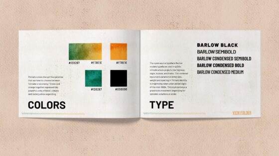
Colors
Thrive’s colors disrupt the narrative that we have to choose between “climate or economy.” Green and orange together represent the powerful unity of labor, climate, and racial justice organizing.

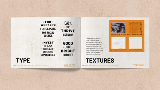
Type
The open source typeface Barlow models type used in public infrastructure projects like highway signs, buses, and trains. The centered layout and variation in letter size, weight, and spacing in Thrive’s identity is inspired by labor union picket signs of the mid-1900s. This style conveys a grassroots movement organizing for systemic solutions at scale.

Textures
Through layering textures, Thrive materials take on a distressed look that reflects an agenda made by and for people, not machines. The placement order from top to bottom and blend mode used for each texture are specified in the file name.

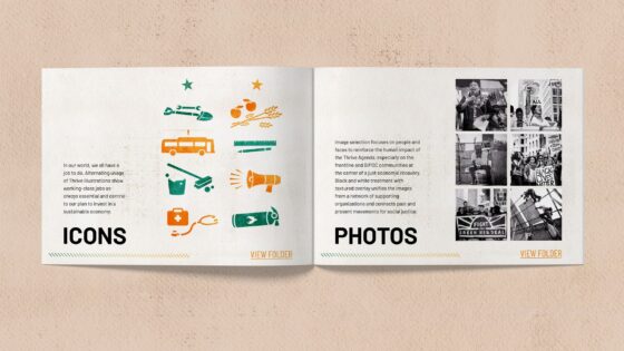
Icons
In our world, we all have a job to do. Alternating usage of Thrive illustrations show working-class jobs as always essential and central to our plan to invest in a sustainable economy.

Photos
Image selection focuses on people and faces to reinforce the human impact of the Thrive Agenda, especially on the frontline and BIPOC communities at the center of a just economic recovery. Black and white treatments with textured overlay unifies the images from a network of supporting organizations and connects past and present movements for social justice.

Design Services

Art Direction

Brand Strategy

Communications Strategy

Copywriting

Style Guide

Visual Design

View the Style Guide


16
Aug

Reform L.A. Jails

A Black Lives Matter Ballot Initiative

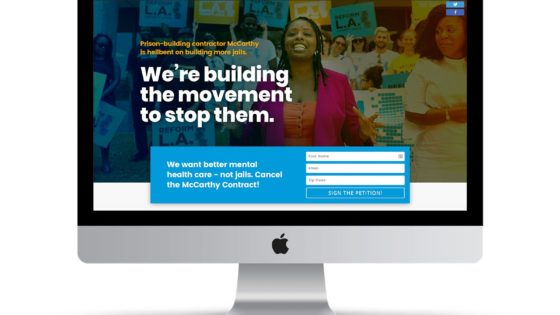
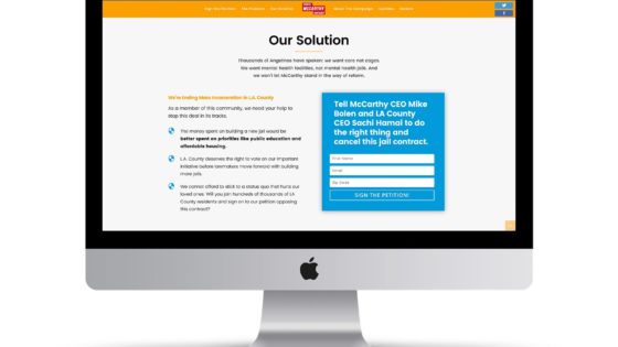
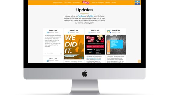
In July of 2019, Los Angeles County Board members decided to pay McCarthy Building Companies $30 million dollars to begin designing L.A. County’s 8th jail.

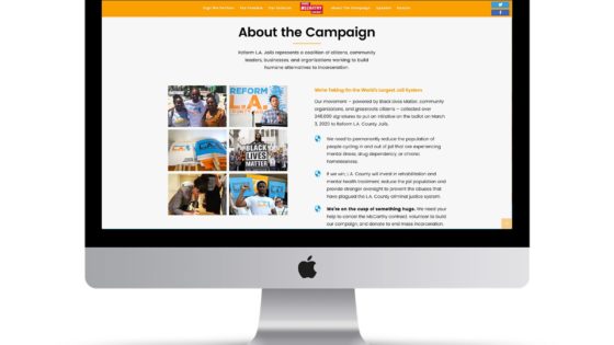
Reform L.A. Jails, a 2020 ballot initiative powered by Black Lives Matter, community organizations, and grassroots activists, immediately ran a rapid-response campaign to #CancelMcCarthy.

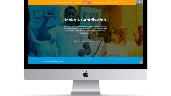
I designed this conversion-focused campaign website, signing up thousands of voters and generating enough public pressure to successfully cancel the jail contract one week after pushing the website live.

Design Services

User Experience

Content Strategy

Copywriting

Information Architecture

Art Direction

Visual Design

Front End Development

Page Speed Optimization


25
Jan
10
Nov